Storytelling in business communication begins with a defined moral of the story. We start with a goal and develop a narrative that resonates with the audience to promote action.
Data storytelling is different. The narrative unfolds as data are compiled, transformed and analyzed. The plot and the moral reveal themselves as various visualizations are explored. The designer then crafts the visualization so that audiences are brought to a data epiphany.
This process can be simultaneously frustrating, exhausting, exhilarating and rewarding. Paxton Battishill’s journey to create an interactive resume illustrates the unpredictable nature of data storytelling. His experience provides insights into overcoming challenges and embracing the plot twists that ultimately shape a data narrative.
Vision and Revision
Initially, Paxton imagined his project as timelines. "I just wanted to visualize timelines outside of school," he says, emphasizing his goal to highlight professional milestones beyond academics.
Collecting data was straightforward; formatting it posed significant challenges. He thought using a model would significantly cut down his data labor, yielding more time to customize his design. “I’m a huge ‘work smarter not harder’ kind of guy, so I copied the data and document from [a tutorial],” Paxton says. “I'll just go through and change this stuff, and then on the other end of Tableau, it will map it all out for me how [the tutorial] has it, but it's going to be my data. Incorrect. Wrong."
Starting anew, Paxton switched between Excel and Tableau to adjust the data formatting. He reconfigured settings, changed data types, and created calculations. With each step, he tested the effects on his preliminary charts.

Figure 1: Paxton's data source page in Tableau; challenges included reassigning data types and creating calculations.
From Exploration to Affirmation
While a resume is a document geared toward potential employers, Paxton also hoped to use the data visualization process for another purpose: to determine if he was on the right career path.
In visualizing his history, he recognized that his perception of time spent vs. actual time spent differed radically based on the position. Six months as a server seemed like eons, while a year spent working in sports broadcasting felt like he had only just begun.
An additional affirmation emerged as he saw how rapidly his freelance photography reputation had grown. “Going into high school, I didn't have any experience in this field,” Paxton recalls. “I've been doing this for [two years] and people have really appreciated my work and like what I do.” Seeing how far he had come in such a brief time confirmed Paxton’s belief that he was growing professionally — and loving it.

Figure 2: Creating a visual timeline allowed Paxton to see the extent of his media experience.
Plot Twists Ahead
Data storytellers at times must sacrifice the story they want to tell because of the data structure, a lack of resources or the constraints of limited experience.
Paxton had a relatable challenge with this project: creating a polished deliverable using new technologies with a steep learning curve. He wanted his interactive resume to be persuasive and professional, but he was not a data visualization or Tableau expert — he was a student enrolled in a class.
In 16 weeks, Data Visualization for Media students at Texas Tech University swiftly move from learning data and design concepts to visualizing using industry-standard applications. “I felt like I wasn’t familiar enough with how to use Tableau. Excel alone — I hadn't even taken an Excel class before," Paxton says. He knew Tableau’s features and potential, but deadlines for this and other projects limited what he could accomplish.
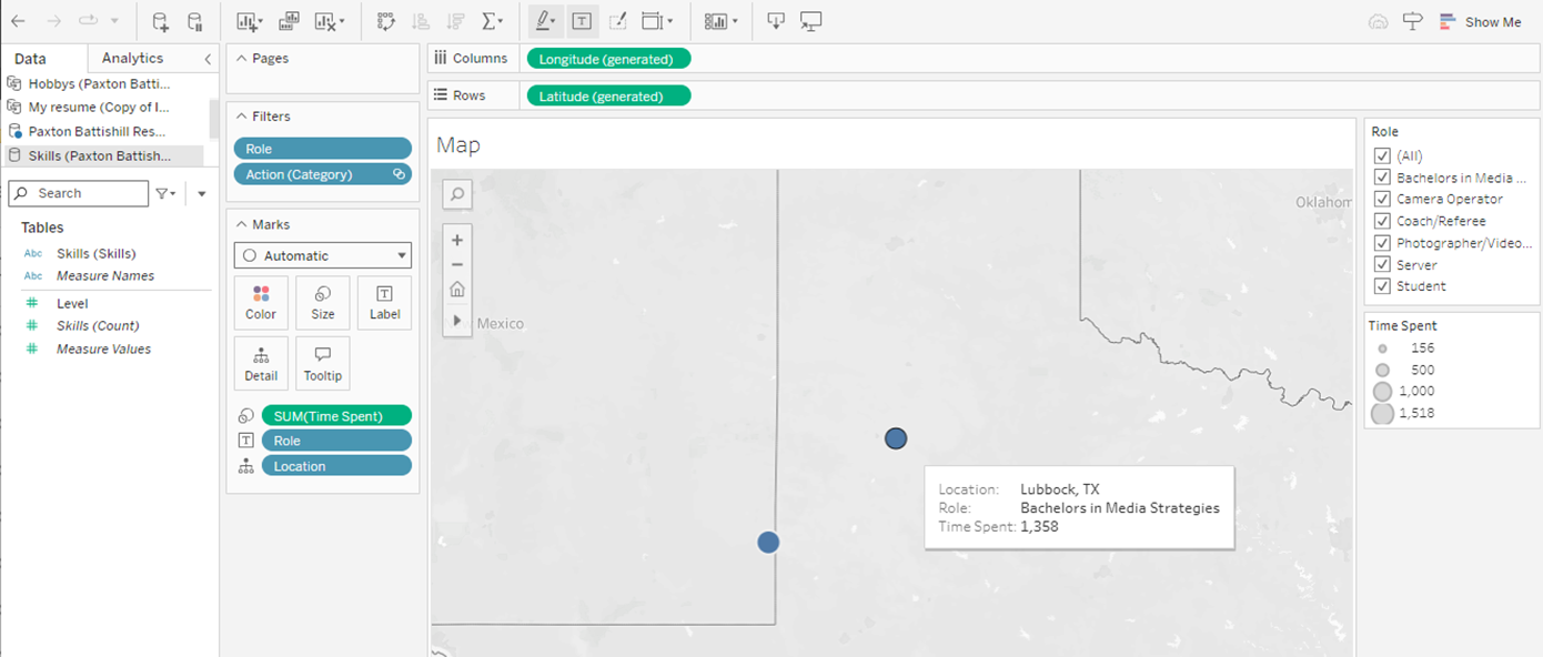
Paxton, therefore, altered his vision and aimed for functional adequacy rather than strategic depth. For instance, he wanted to show how his studies and experience had been split between Lubbock, Texas, and Hobbs, New Mexico, but he could not get it to look exactly as he wanted.

Figure 3: Map showing locations where Paxton has worked and attended school. While functional, the map did not have the visual impact he was hoping to achieve.
Eventually, he had to make a hard decision. "Whatever would have popped up … that was decent-looking to me would have sufficed, as long as I met the bottom line," he says. “If I could use this tool to my maximum ability — the things that I'd be able to create and the way I'd be able to make it look — it would definitely be a whole lot cooler.”
Furthermore, the nonlinear flow of data visualizations presents unique challenges when crafting the plot line. Rather than reading top to bottom, audiences will start with the biggest concentration of color or density. Adapting to written genre conventions, while tempting, will likely be less effective.
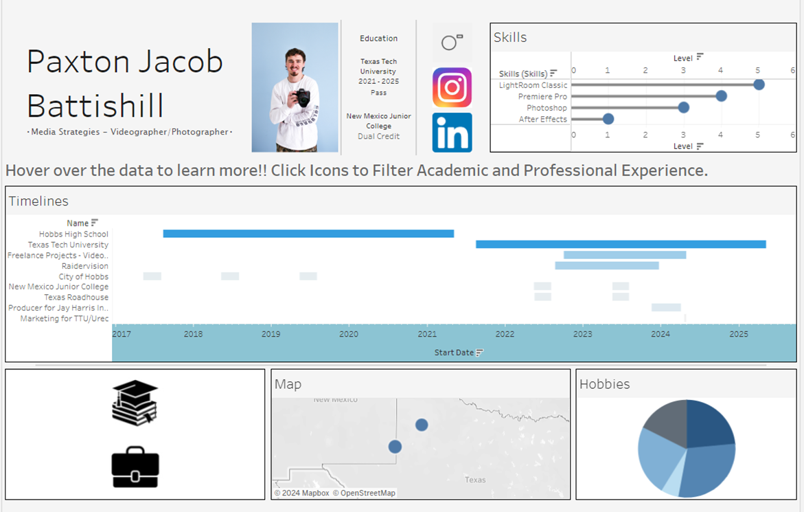
Paxton’s interactive resume was structured “to flow a lot like an actual resume.” He envisioned the audience’s reading to process as “starting out with my name, major occupation or desired occupation, and a photo of myself,” adding, “going down, usually the first thing you'll see is education.”
The constraints of a resume designed to fit screens rather than paper, however, necessitated changing his plans. For example, the skills section was appended to the end of the first row. This and other choices impacted the storyline and user experience.
Reviewing his work months after submitting it, he realizes that the visual flow is disrupted. The audience’s attention is drawn to areas of density: LinkedIn and Instagram logos, hobbies, then education data points. However, the data he wanted to “pop” for his viewers was his creative work, including the portfolio link (above social media icons) and his professional experience.

Figure 4: Paxton's final submission differs greatly from his original vision, but it still achieves several of his original goals.
The Moral of the Story
Paxton’s experience creating an interactive resume highlights only some of the plot twists of data storytelling. While he is pleased with what he achieved, he acknowledges that more time and experience would have allowed him to manifest his vision.
His journey emphasizes the importance of clear objectives, flexibility and user-centered design in crafting effective data narratives. The continuous need for improvement and adaptation highlights the unpredictable yet rewarding nature of data storytelling.